


A new version of the Web Content Accessibility Guidelines (WCAG) is expected to be released in the coming weeks or months. Therefore, this will bring some changes and new success criteria to conform with for your websites and apps.
What's Coming in WCAG 2.2?
View the video of What's coming in WCAG 2.2 with Matt Putland - our free lunchtime webinar held on September 23, 2021.
A new version of the Web Content Accessibility Guidelines (WCAG) is expected to be released in the coming weeks or months. Matt discusses the new selection criteria in WCAG 2.2.
Skip to:
- What is WCAG?
- What is WCAG 2.1?
- The new success criteria
- 2.4.11 Focus Appearance (Minimum) (Level AA)
- 2.4.12 Focus Appearance (Enhanced) (Level AAA)
- 2.4.13 Page Break Navigation (Level A)
- 2.5.7 Dragging Movements (Level AA)
- 2.5.8 Target Size (Minimum) (Level AA)
- 3.2.6 Consistent Help (Level A)
- 3.2.7 Visible Controls (Level AA)
- 3.3.7 Accessible Authentication (Level A)
- 3.3.8 Redundant Entry (Level A)
- Conclusion
What is WCAG?
The Web Content Accessibility Guidelines is an internationally recognised benchmark for web content accessibility, with the overall goal of making the web more accessible to people with disabilities. Members from the W3C created it, an international organisation that defines standards for the web; this includes HTML, CSS and WAI-ARIA. Members who assist in creating the guidelines or standards consist of individuals from large member organisations such as Google, Microsoft and Apple, to smaller organisations or individuals.
WCAG 2.0 was a version of WCAG released in December 2008, and it's the version of WCAG that most of the world is familiar with. WCAG 2.0 has three conformance levels, A, AA, and AAA. Each conformance level has its own set of success criteria.
- Success criteria in level "A" are critical; people cannot access content without these success criteria being met.
- Success criteria in level "AA" are essential; some people may have significant barriers without these success criteria being met.
- Success criteria in level "AAA" are useful, possibly essential for some. However, most organisations will only "cherry-pick" from the "AAA" success criteria, as often not everything in level "AAA" would be relevant for every kind of website.
All success criteria within a level must pass to conform to that level, including success criteria from lower levels. So, this means; to claim conformance with WCAG 2.0 level AA, you must pass all success criteria in levels A and AA.
WCAG 2.1 is an extension of WCAG 2.0, released in June 2018, that introduced 17 new success criteria dispersed across the three conformance levels. It focused on improving accessibility for mobile, people with low vision, and some changes for people with cognitive disabilities. None of the original success criteria in WCAG 2.0 were changed when WCAG 2.1 was released.
In Australia, Government and non-government websites should be conformant with WCAG 2.0 level AA at a minimum. However, many organisations in Australia choose to conform with WCAG 2.1 level AA instead on an internal Accessibility policy level. When WCAG 2.2 is released, organisations may change their internal policies to align with the new version of the guidelines. As a side note, the AS EN 301 549 standard states that procured web software should be conformant with WCAG 2.1 level AA.
What is WCAG 2.2?
WCAG 2.2 is the upcoming new version of the guidelines, and it is another extension, just like WCAG 2.1. WCAG 2.2 currently adds nine success criteria spread across the three conformance levels, making it likely an easier transition than moving from version 2.0 to 2.1.
WCAG 2.2 makes one change to the original WCAG 2.0 success criteria. The Success Criterion 2.4.7 Focus Visible has changed from a level AA success criterion to a level A success criterion, which is now considered critical. As such, this was done as stricter requirements for focus indicators were introduced in WCAG 2.2.
Note that if your website is conformant with only WCAG 2.0 level "A", this change will not make your claim to WCAG 2.0 level "A" conformance invalid. The change only applies if you are targeting WCAG 2.2 level "A" conformance.
The new success criteria
The following sections outline and explain the new success criteria likely coming in WCAG 2.2.
2.4.11 Focus Appearance (Minimum) (Level AA)
Link to Understanding 2.4.11 Focus Appearance (Minimum)
One of the largest and most notable success criteria introduced is new requirements around focus indicators.
Focus indicators are used by keyboard navigators or switch control navigators. The focus indicator shows where you are on the page, and you can move your focus position using the [TAB] or [Shift]-[TAB] keys (you can try this yourself on any website – can you see your focus indicator clearly?). Generally, only interactive objects should be keyboard focusable.
A common issue in websites is that the focus indicator is difficult to see. While 2.4.7 Focus visible existed in WCAG 2.0 and covered that focus indicators must be "visible", it did not provide guidance on how visible the focus indicator should be. "Visible" was defined as "Can be seen", ultimately making a single-pixel dot for the focus indicator enough to pass the guideline technically.
1.4.11 Non-text Contrast, introduced in WCAG 2.1, required that focus indicators must have at least a 3:1 contrast ratio against the background colour. While this helped the problem, it meant that you could have a very small/barely noticeable focus indicator and still pass.
To conform with WCAG 2.2 level AA, focus indicators now must:
1. Contrast well (at least 3:1) when comparing the focused and unfocused states.
At least a part/area of the focus indicator has a 3:1 contrast ratio when comparing the colours of the focused and unfocused states. For example, a light grey border focus indicator on a white background is difficult to see.
2. Have a defined minimum size.
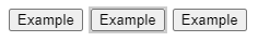
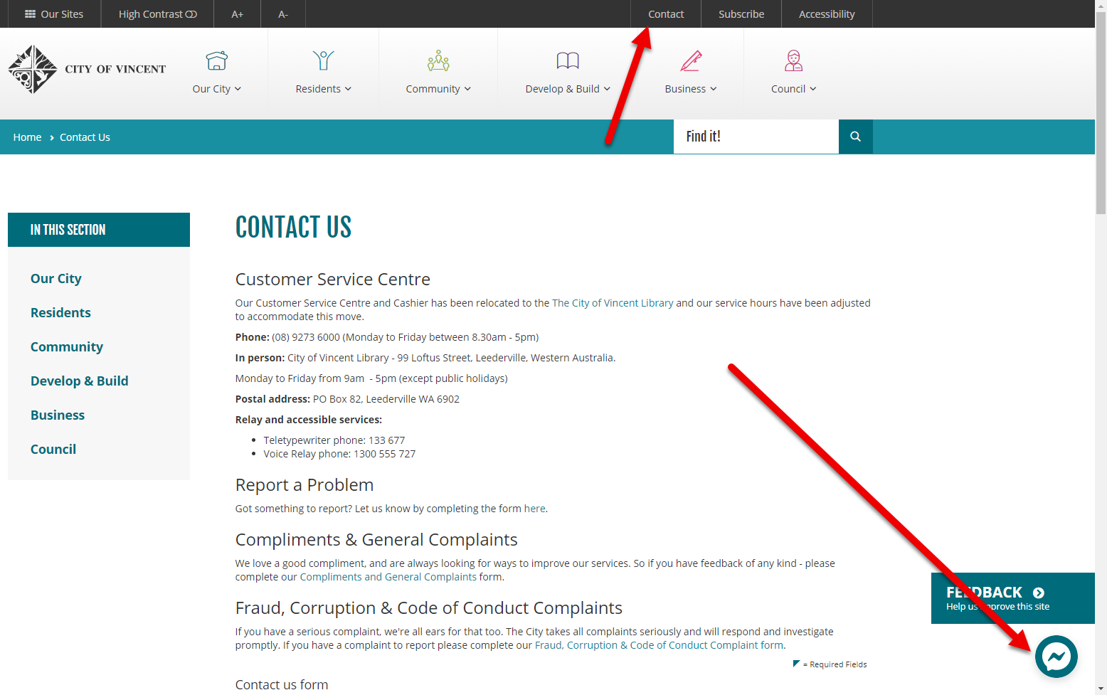
This requirement will bring an end to minimal focus indicators on websites. The outline of a focus indicator must be as large as a 1px thick perimeter of the unfocused component, or at least a 4px thick indicator on the shortest side of the control (but no less than 2px thick).
This requirement states that the focus indicators have a different size requirement based on the button's size. For example, if the outer border of a button is 236px (90 + 90 + 30 + 30 = 240px, minus 4px for rounded corners), then the total size of your focus indicator must be at least 236px. The focus indicator could be an outline box, an underline, or potentially a different border design. Still, the area of the focus indicator must be at least the perimeter of the button.
Examples:


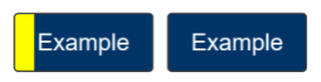
Figure 4: Instead of an outline, a shape could be used for your focus indicator. This example has a button with a thick focus indicator on the shortest side of the button. For it to pass, the focus indicator must be at least 4px thick along the shortest side of a minimum bounding box and no less than 2px wide.
3. Contrast well with what's adjacent to it.
For example, a blue focus indicator on a blue button is still very hard to see. Instead, try using a different colour for the indicator that contrasts well (a least a 3:1 contrast ratio) or having a gap between the button and the indicator.

4. Not be fully obscured.
The focus indicator should never be fully obscured by something else, such as a static footer banner on a webpage. It can, however, be partially visible.
Additional Notes:
- A blinking text cursor in a text field will not meet 2.4.11, so focused text fields will need a clear focus indicator.
- Changing the button's background colour would pass 2.4.11, as long as the colour change has a 3:1 contrast ratio between the focused and unfocused state.
- Default browser focus indicators will fail if they do not meet the requirements of 2.4.11.
2.4.12 Focus Appearance (Enhanced) (Level AAA)
Link to Understanding 2.4.12 Focus Appearance (Enhanced)
The only new level AAA addition to WCAG 2.2 is a stricter version of focus appearance. Due to this, it's more straightforward to understand as there's less flexibility and fewer customisation options.
To conform with WCAG 2.2 level AAA, focus indicators now must:
1. Contrast well (at least 4.5:1) when comparing the focused and unfocused states.
The colour contrast requirement for focus indicators is stricter at level AAA, needing a 4.5:1 contrast against the focused and unfocused states.
2. Minimum size needs to be larger.
The minimum size is also stricter. The focus indicator size must be at least double the size of a 1px thick perimeter of the unfocused control. Therefore, a 2px thick outline would usually be enough to pass the minimum size requirement, whereas a 1px thick outline would only pass the minimum size requirement at level AA.
3. Must not be obscured at all.
The focus indicator must not be obscured at all, even partially. This issue often occurs with static footer elements on web pages.
2.4.13 Page Break Navigation (Level A)
Link to Understanding 2.4.13 Page Break Navigation
A very specific success criterion refers to content broken up by pages, such as online books. The simple requirement is that there needs to be a mechanism in place to skip to a specific page number.
This is very helpful in classroom settings, where the teacher may instruct the class to turn to page 28; a function should be made available to skip straight to page 28. However, some users with low vision may increase the text size in a document, causing more pages to appear in their view of the document; they must be able to skip to the intended page 28 as specified in the document.
Most organisations will use an existing e-reader tool rather than making one themselves, so it's important to ensure that the tool you use supports this page skipping feature.
2.5.7 Dragging Movements (Level AA)
Link to Understanding 2.5.7 Dragging Movements
This success criterion provides additional guidance around how to make drag-and-drop functionality accessible.
Initially, 2.1.1 Keyboard and 2.1.3 Keyboard (No Exception) in WCAG 2.0 mentioned that drag and drop features need to be keyboard accessible. Criterion: 2.5.7 Dragging Movements was added to benefit people who may have difficulty performing dragging motions with a pointer interface (e.g. a mouse, or a finger on a touch screen) but may not or cannot use a keyboard instead.
This success criterion requires that the functionality of drag and drop features be made available through only single pointer interaction (e.g. a mouse click or tap on a touch screen). Unless the dragging action is essential to the functionality, gesture or drag action should not be needed to control the drag and drop functionality.
As one example, A mechanism could be added so that a user only has to single click/tap on the object they want to move and then single click on the area they want to drop the object. Another example could be a drop-down list next to each option, allowing you to move an object to a specific order in a list or a certain category.
2.5.8 Target Size (Minimum) (Level AA)
Link to Understanding 2.5.8 Target Size (Minimum)
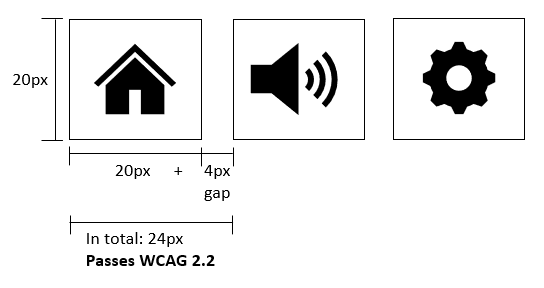
WCAG 2.2 provides a new requirement on how large the touch/clickable area of a control should be.
This isn't referring to the visible size of the control but is more concerned with ensuring that the clickable or touchable area of a control is large enough so that users don't accidentally activate a control next to it. In the success criterion, this is referred to as the "Target".
Targets must have an area of at least 24 by 24 CSS pixels to conform with WCAG 2.2 level AA, except where:
- There's already enough spacing with other controls. If your control is on its own and isn't within 24 CSS pixels of any other adjacent target, you do not need to ensure the target size of your button is at least 24 x 24 CSS pixels.
- It's within a sentence or block of text. This is mostly referring to links within sentences or paragraphs. However, lists of links still need to have enough spacing/clearance between each link in the list.
- It's essential to the design. For example, Map pins on a map that are very close to each other are exempt; otherwise, the map pins would be in the wrong location. Exceptions also include legal reasons, like how a website needs to be visually similar to a paper-based form.
This success criterion will be relevant in situations where there are a lot of controls next to each other, such as text editor tools, or when there are many icon buttons next to each other. It's important to be aware that the requirement isn't that all buttons need to be at least 24px by 24px in size, just that there is enough space for each button.
The Understanding 2.5.8 Target Size (Minimum) page provides many other visual examples of passing and failing target sizes. In WCAG 2.1, the very similar success criterion 2.5.5 Target Size was introduced, but it was a level AAA success criterion, which in practice meant it wasn't commonly implemented into websites. This success criterion still exists in WCAG 2.2 and requires that targets be at least 44x44 CSS Pixels. See Understanding 2.5.5 Target Size (Level AAA in WCAG 2.1)
3.2.6 Consistent Help (Level A)
Link to Understanding 3.2.6 Consistent Help
This success criterion states that if your website provides a help function, it is to be consistently located on every page.
Often, as users navigate through web pages in a website, they may need help at any moment. Therefore, any help features in the website must be in a consistent location to access that help without causing a significant cognitive load.
Note that this success criterion does not state that help features are required in a website – that's already covered by 3.3.5 Help (Level AAA) in WCAG 2.0, but just that if your website does provide help, it's in a predictable location.
A help mechanism could be any of the following:
- Human contact details;
- Human contact mechanism;
- Self-help option;
- A fully automated contact mechanism.
This success criterion becomes more nuanced when you really look into it, though, as it may be extremely difficult for a website to always have a help feature in the same location. For example, desktop and mobile screen sizes are different, so it may be necessary to have a different location.
Websites may also have sub-domains with different page layouts, and therefore, it may not be possible to have the help feature in the same location.
Therefore, this is why the success criterion itself is careful not to use the word "Location" and instead use "help is included in the same relative order on each page". This means the location is more general, in that if your help is positioned in the top right of the page, then it should generally be in the top right of other pages as well, but doesn't need to be in the exact location.
3.2.7 Visible Controls (Level AA)
Link to Understanding 3.2.7 Visible Controls
Some functionality/features in websites may only reveal themselves when you mouse hover or move keyboard focus to the control. For example, you could mouse hover over some paragraph text, and only then will you find an edit button that allows you to edit the text.
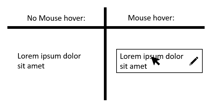
It's now required that you don't have any controls that only make themselves known on mouse hover or keyboard focus to conform with WCAG 2.2 level AA. There must always be some sort of indicator that a feature is available. For example, a "pencil" icon could be added next to some text that you can edit that is always visible, and then mouse hovering will reveal further controls – this is fine. The point is to ensure that the functionality isn't hidden completely.
As usual, there are some exceptions to the rule:
- The information needed to identify the user interface components is available through an equivalent component that is visible on the same page or on a different step in a multi-step process without requiring pointer hover or keyboard focus;
- The component is specifically provided to enhance the experience for keyboard navigation (e.g. a skip link that reveals itself on keyboard focus);
- A mechanism is available to make the information persistently visible;
- Hiding the information needed to identify the component is essential.
This success criterion benefits a wide range of people with disabilities. For example, people with cognitive disabilities may easily become stuck in a process or not remember how they performed a specific action on a previous visit. People with low vision often miss or have a limited screen view, so hidden controls make finding content even harder. People who use alternative input methods may struggle as well, some people use voice input technology to navigate, but if they can't see the control, they may not even know it exists or know what to say to activate it.
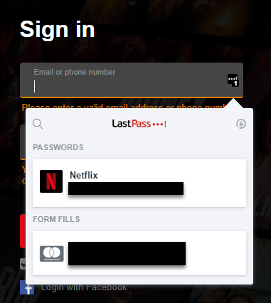
3.3.7 Accessible Authentication (Level A)
Link to Understanding 3.3.7 Accessible Authentication
This success criterion makes it, so users don't have to memorise or transcribe something to log in. For example, remembering the passwords for your many online accounts are extremely difficult. So many make use of password managers (as a browser extension or built-in with the web browser) to help manage and remember passwords for them. In some cases, it is a necessity for people with cognitive disabilities or people who are elderly.
Some login forms, however, purposely prevent these tools from working. Therefore, to conform with WCAG 2.2 level A, you'll need to ensure that you do not prevent these tools from auto-filling or suggesting the user's passwords, or at least provide another method to log in that doesn't require a password or cognitive test.
Examples of authentication that do not need a password include "WebAuthn", a technology that allows the user to log in using your generic device password, such as a PIN that you would use to unlock your device.

There are also 3rd party "Oauth" methods of logging in. In this case, the website will ask you to log in with Google or Facebook or a similar 3rd party account – these also provide accessible methods of logging in that do not require a user to remember a username or password.
One common criticism of auto-fillable passwords fields is that it decreases security for the account. In truth, users who cannot auto-fill their password are more likely to use simpler and shorter passwords or passwords that are the same across multiple different accounts, making their accounts more vulnerable to different forms of attacks from intruders. Allowing auto-fill or password managers to work on the website allows users to have more complex and varied passwords, overall increasing security.
The last thing to be aware of is that WCAG 2.2's definition of a Cognitive function test includes transcribing. So your username and password field should allow users to copy and paste in a username or password from somewhere else unless another accessible method of authentication is available.
3.3.8 Redundant Entry (Level A)
Link to Understanding 3.3.8 Redundant Entry
In this final success criterion introduced in WCAG 2.2, a form in a website should never ask for the user to input the same information twice within a process/flow. So, for example, if a form asks for a user's ID number in the first step of the form, the user shouldn't have to put in their ID number again later in the form.
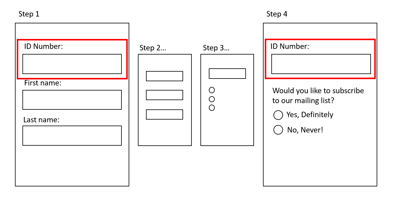
It's allowed for the same form field to appear multiple times in a form. However, they should be pre-populated based on what the user already inputted earlier, or at least the user's input should be available for the user to select.
Again, there are some exceptions to the rule:
- re-entering the information is essential,
- the information is required to ensure the security of the content, or
- previously entered information is no longer valid.
This success criterion, of course, assists people with cognitive disabilities as they will not have to recall a piece of information more than once. It also greatly assists people who use alternative input methods as there's a reduced need for text entry.
Conclusion
WCAG 2.2 provides many overdue success criteria that will greatly assist people with cognitive disabilities or who rely on mobility aids. Much of the new success criteria are fairly tightly scoped or may already be passing on your website, but a few things, like Focus appearance and Target size, are likely to fail on many websites currently out there.
When WCAG 2.2 releases, it's likely we'll see organisations start to adopt WCAG 2.2 in their accessibility policies, and likely a much longer time before we see WCAG 2.2 in Australian legislation. However, suppose you're a designer or developer in an organisation that hasn't adopted WCAG 2.2 yet. In that case, there's no harm in sneaking in these WCAG 2.2 requirements where you can and making a better, more accessible website right now.