On this page

Introduction

Forms are everywhere on the web. They are an efficient way to collect data, and when created accessibly, they can speed up processes for users and reduce cognitive load.

One common accessibility issue in forms is the lack of proper grouping and labelling for related form controls. This blog will focus on two powerful HTML elements - <fieldset> and <legend>. Whether you're a web developer, auditor or quality assurance officer, you will learn how the use of these elements can significantly improve form accessibility.


The problem: Ungrouped form controls

We often use groups of related form inputs to collect information on a subject or to offer multiple options to a question.

These groups are commonly designed with the overall question or subject above the group, followed by individually labelled inputs.

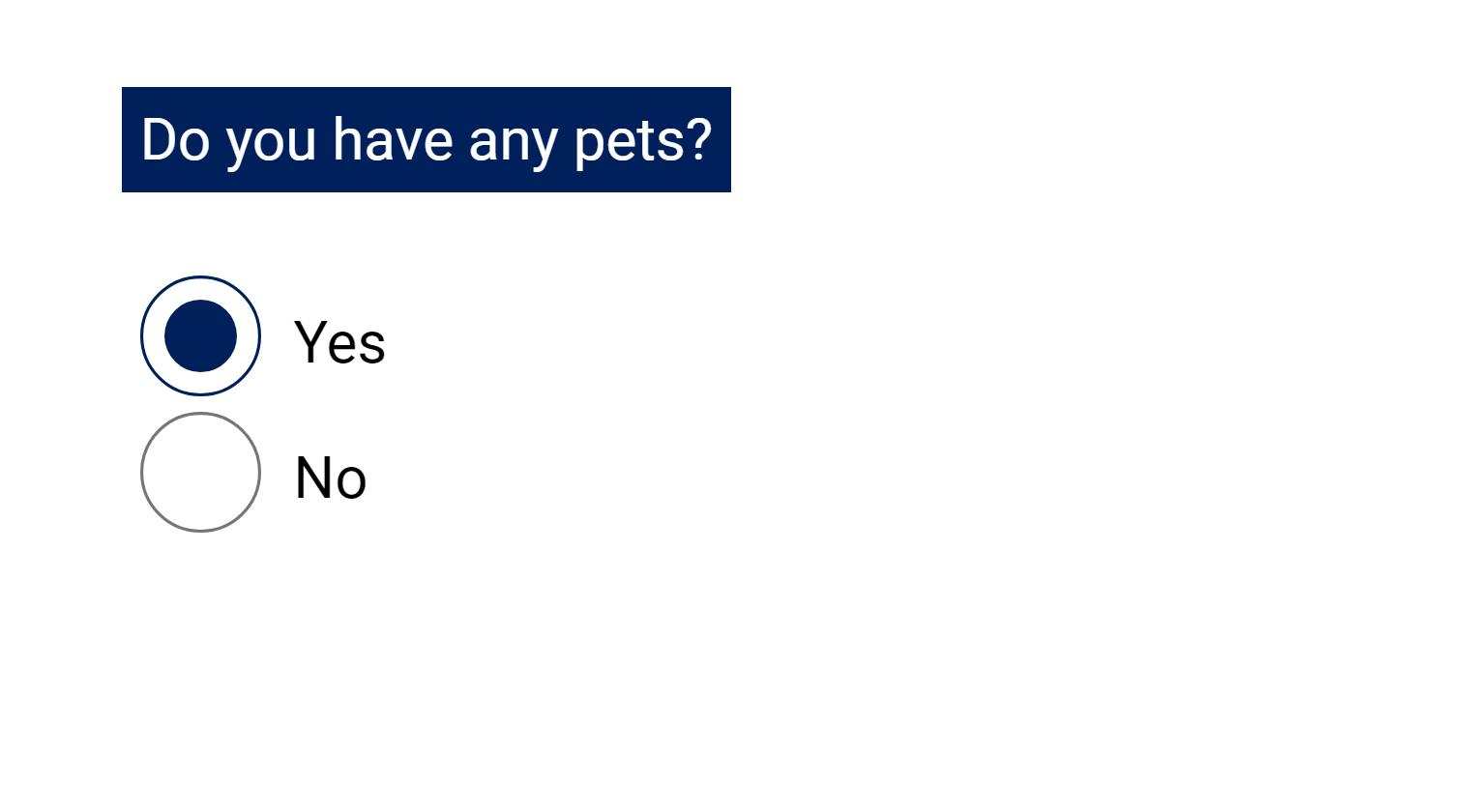
In the below example, the question "Do you have any pets?" is followed by inputs for "Yes" and "No". In the code, the question has not been grouped with the inputs.


Example of grouped radio buttons. The label above the inputs reads 'Do you have any pets?' followed by radio buttons with the labels 'Yes' and 'No'.

<form>
<p>
Do you have any pets?
</p>
<label for="yes">
Yes
</label>
<input id="yes" name="pets" type="radio" value="yes">
<label for="no">
No
</label>
<input id="no" name="pets" type="radio" value="no">
...
<form>

Visually, the relationship between the overall question and the individual inputs is clear.

However, for a screen reader user navigating the form with the Tab key, they will only hear something like:

"Yes radio button, checked, 1 of 2"
"No radio button, not checked 2 of 2"

The individual labels are announced, but the question is not.

Challenges for screen reader users

Most screen reader users navigate forms using the Tab key. Additionally, many screen readers will automatically switch to a different mode of interaction, known as 'forms' or 'focus' mode, when they encounter a form. These modes disable standard screen reader navigation shortcuts, so that users can enter data into forms.

This is an efficient way to navigate, and helps users move quickly between inputs. However, when navigating this way, only text that has been grouped, or programmatically associated with an input, will be announced when the input receives focus.

When the question or topic for a group of related inputs has not been grouped with the inputs, screen reader users must exit out of forms or focus mode and use arrow keys to navigate around the input and try and find the additional context they need.

As you can imagine, this can be frustrating, slow users down, and increase the risk of errors. It can be especially problematic if your form is long and contains multiple sets of grouped controls.


The solution: Grouping with < fieldset > and < legend > elements

HTML provides us with a great solution to this problem with the <fieldset> and <legend> elements.

We use the <fieldset> element to contain the entire grouping, including the overall question or topic, all inputs and labels. The <legend> element is then used as the first child of the <fieldset> to contain the overall question or topic.

Here's how we can improve the previous example:

<form>
<fieldset>
<legend>
Do you have any pets?
</legend>
<label for="yes">
Yes
</label>
<input id="yes" name="pets" type="radio" value="yes">
<label for="no">
No
</label>
<input id="no" name="pets" type="radio" value="no">
</fieldset>
... 
</form>

Now when a screen reader enters this group, a user will hear something similar to:

'Do you have any pets?  Grouping'
'Yes radio button, checked, 1 of 2' 
'No radio button, not checked 2 of 2'

This simple change provides screen reader users with the necessary context, making the form more understandable and easier to navigate.


When to use the fieldset and legend elements

The <fieldset> and <legend> elements can be used to group any related form inputs that require a label to provide overall context.

Common scenarios include:

  • Groups of radio buttons and checkboxes
  • Related text inputs, for example, address details
  • Date input groups

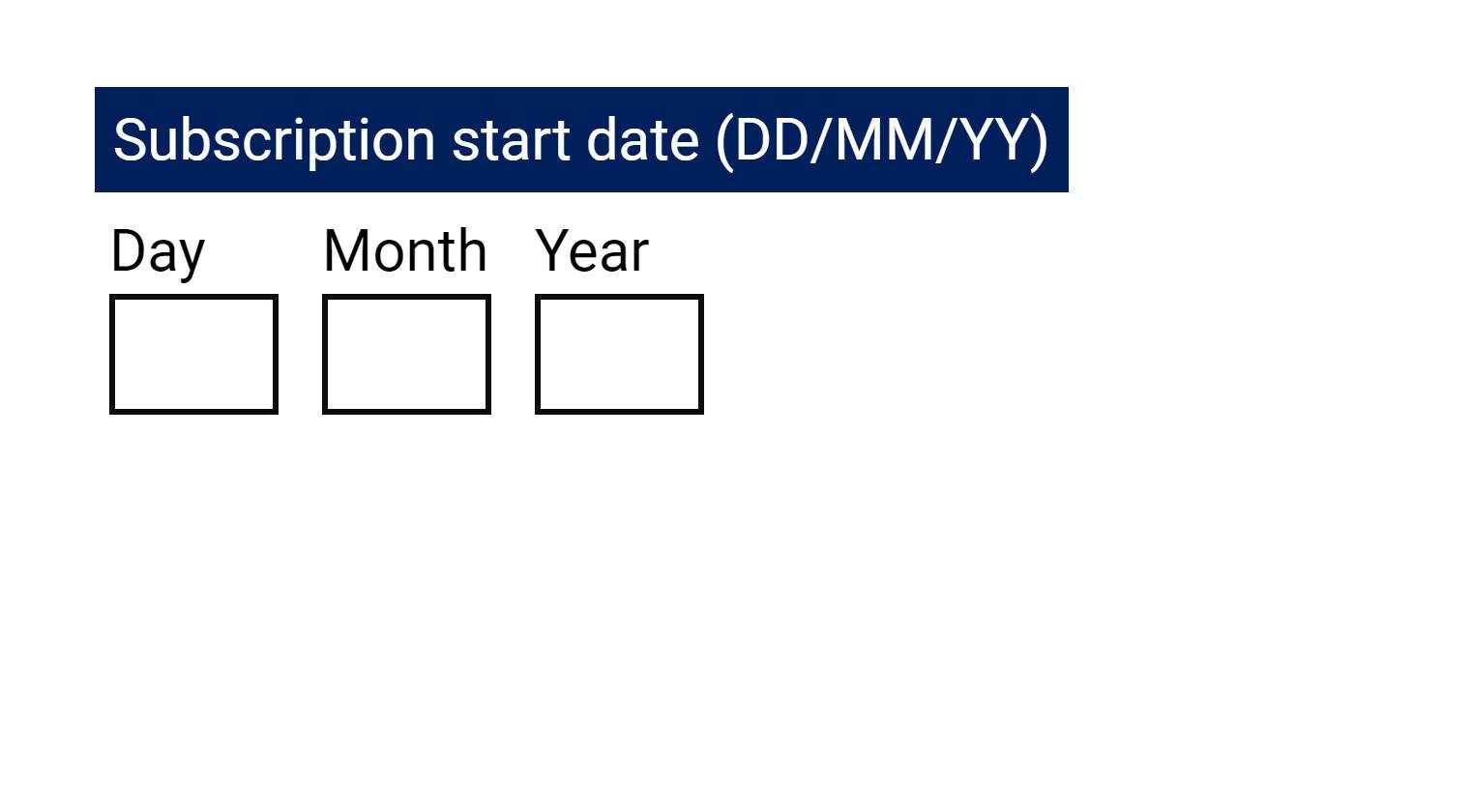
The below example shows how a group of text inputs with the question of "Subscription start date (DD/MM/YYYY)" can be grouped with <fieldset> and <legend> elements.

Example of grouped date inputs. The label above the inputs reads 'Subscription start date (DD/MM/YY)' followed by text input with the labels 'Day', 'Month' and 'Year'.

<form>
<fieldset>
<legend>
Subscription start date (DD/MM/YY)
</legend>
<label for="day">
Day
</label>
<input id="day" name="day" type="text" inputmode="numeric">
<label for="month">
Month
</label>
<input id="month" name="month" type="text" inputmode="numeric">
<label for="year">
Year
</label>
<input id="year" name="year" type="text" inputmode="numeric">
</fieldset>
… 
</form>


Conclusion

Using the<fieldset> and <legend> elements is a simple yet powerful technique for improving form accessibility. As web professionals, it's our responsibility to implement these techniques to ensure an equitable experience for all users.

By properly grouping and labelling form controls, we can create more inclusive web experiences and adhere to important accessibility guidelines, such as WCAG Success Criterion 1.3.1 (Info and Relationships) and 4.1.2 (Name, Role, Value).


Additional Resources

Understanding Success Criterion 1.3.1: Info and Relationships

More detail on the information and relationships WCAG success criterion.

Understanding Success Criterion 4.1.2: Name, Role, Value

Further detail on the name, role and value WCAG success criterion.

Technique H71: Providing a description for groups of form controls using fieldset and legend elements

More information on the technique for the grouping of related form controls.

HTML Standard - The fieldset element

More information on the HTML standard for the fieldset element.

HTML Standard - The legend element

More information on the HTML Standard for the legend element.


Make your data and reporting accessible to everyone

Now that you’ve learned how to make your data collection more accessible — what about your reporting? Displaying infographics and charts in an inclusive way requires the right know-how and resources for digital accessibility.

Digital Access Training has a range of focused on-demand training courses that provide  you with the skills you need in under an hour. From writing alt-text for data visualisation to colour accessibility for information, you’ll be creating more inclusive digital assets in a snap. And as a division of Vision Australia, all course costs support the provision of services, resources and advocacy for Australians who are blind or have low vision.

Explore Digital Access on-demand courses

Get the tools to create accessible and inclusive digital assets.

Global leaders in digital access

If you’re ready to elevate your digital experiences, let’s talk. We’ve delivered over 1000 accessibility projects and countless hours of training — guiding teams to deliver on inclusion. Contact us to learn how or subscribe to our newsletter for expert insights in your inbox.

Contact us Sign up to our newsletter