On this page

Colour palettes are a big deal in designing digital assets. Not only do they lay the visual foundation of your brand, but the right colour use can also create more accessible and user-friendly digital experiences.

There are plenty of colour accessibility tools, resources and design principles that support appealing layouts for digital designs. One such principle is the ’60-30-10’ rule, which can serve as a helpful guide when selecting your colour palette.

What is the 60-30-10 rule in digital design?

The 60-30-10 rule is a simple yet effective colour scheme principle. It recommends dividing your design into three colours in the following proportions:

  • 60% primary colour (dominant)
  • 30% secondary colour (supporting)
  • 10% accent colour (contrast)

This ratio became popular in interior design for its balanced visual appeal, but the 60-30-10 rule is finding its place in digital designs for its ability to enhance navigation and digital accessibility.

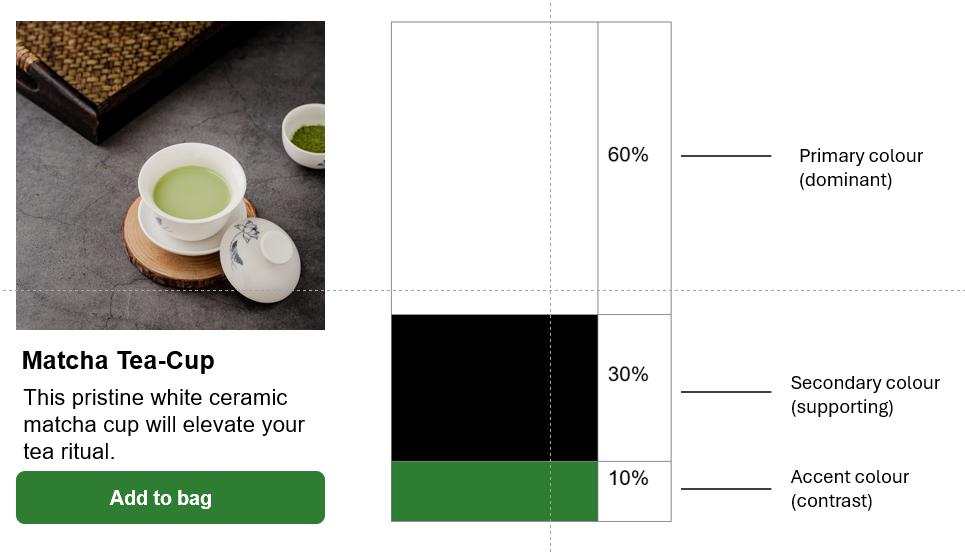
Here’s an example. The image shown below applies the 60-30-10 rule to the background, text and button:

  • White is the primary colour used for the background and button text.
  • Black is the secondary colour for body text.
  • Green is the accent colour used for contrast on the button.
60, 30, 10 rule demonstrated with primary, secondary, and accent colours.

5 accessibility benefits of the 60-30-10 rule

Colour plays a significant role in digital accessibility. Here are five accessibility benefits to applying the 60-30-10 rule to your digital colour palettes.

1. Improved readability and contrast

Contrast is a key consideration in digital accessibility and readability. Web Content Accessibility Guidelines (WCAG) specify minimum contrast ratios to make text readable for users with vision impairments.

Applying the 60-30-10 rule can enhance readability and contrast:

  • The 60% primary colour can serve as the main background 
  • The 30% secondary colour can be used for larger UI elements or secondary backgrounds
  • The 10% accent colour can be applied to important elements like headings, buttons, or links

This distribution allows you to maintain high contrast between text and background, meeting WCAG requirements while creating a visually appealing design.

2. Simplified visual hierarchy

A clear visual hierarchy provides a path for people to navigate. This is crucial for all users, but even more so for those with cognitive disabilities or attention disorders. This is because a structured design approach creates a straightforward experience that reduces cognitive load.

The 60-30-10 rule naturally creates a structured layout that guides the user’s eye through the content.

  • The dominant 60% colour creates a stable base
  • The 30% colour defines major sections or components
  • The 10% accent colour draws attention to key elements or calls-to-action

3. Reduced visual overload

Complex, busy designs can be overwhelming — especially for some people with cognitive and learning disabilities. The 60-30-10 rule helps create a calm, organised visual environment by limiting the colour palette.

By using a dominant colour for 60% of the design, you create a sense of unity and coherence. The secondary 30% colour adds depth without overwhelming, while the 10% accent provides just enough visual interest to guide the user’s attention. 

4. Enhanced colour perception for colour-blind users

Colour blindness affects approximately 1 in 12 men and 1 in 200 women worldwide. By using the 60-30-10 rule, you’re more likely to create designs that are perceivable by users with various types of colour blindness — even if they can’t perceive the exact colours used.

5. Flexibility for dark mode and high contrast settings

Dark mode and high contrast settings are popular for reducing eye strain or improving visibility. Using the 60-30-10 rule, the proportions will remain even when colours are inverted or adjusted to suit different display preferences. This flexible framework ensures that your design remains accessible and visually appealing across various settings.

Designing accessible colour palettes for digital assets

To create inclusive digital experiences, designers need to consider a wide range of accessibility principles and guidelines. The 60-30-10 rule is only one design guide that can support colour palette development.

To develop practical skills for making colour accessible in digital designs, we offer a series of on-demand courses on this topic.

To start using the 60-30-10 rule in creating more inclusive designs, here are seven quick tips to follow:

1. Start with accessibility

Choose your colour palette with WCAG contrast guidelines in mind. Tools like the colour contrast checker in Adobe Colour can help ensure your colour combinations meet accessibility standards.

2. Go neutral for your 60%

Your primary colour should be neutral to serve as a canvas for your content. Light greys, off-whites, or soft, muted colours provide a good foundation for accessible designs.

3. Leverage the 30% colour for structure

Use this colour to define major sections of your interface, like navigation menus, sidebars, or card backgrounds. This helps create a clear visual structure that supports cognitive accessibility.

4. Make the 10% colour count

Reserve your accent colour for important elements like primary buttons, links, or key information. This helps draw attention to interactive elements, benefiting users with cognitive and learning disabilities.

5. Consider patterns and textures

For users with colour blindness, incorporating subtle patterns or textures can provide visual cues beyond colour alone.

6. Test your designs

Use tools like colour blindness simulators to ensure your design is perceivable by users with various types of colour vision deficiencies.

7. Maintain flexibility

Design with adaptability in mind, considering how your colour scheme will translate to dark mode or high contrast settings.

You can learn more about colour theory and how to apply it to accessible designs in the on-demand course, Making Colour Accessible: Colour Palettes.
Take your design skills to the next level

Inclusive design is good business. By prioritising accessibility in your work, you’re not only complying with guidelines – you’re creating better experiences for all users, regardless of their abilities or preferences. 

The Making Colour Accessible courses offer in-depth insights and practical techniques in simple, bite-sized videos that can be studied at your own pace. By combining the principles of the 60-30-10 rule with a comprehensive understanding of accessibility, you’ll be well-equipped to create digital experiences that look great and work well for everyone.

Achieve your accessibility goals

If you would like to know more, contact one of our accessibility experts via email or subscribe to our newsletter for further insights and industry news.  

Explore Digital Access on-demand courses